Sunday, April 12, 2015
Friday, April 3, 2015
Table of Contents
Table of Contents Research Research Research


One of the main concerns I had for my table of contents was choosing a)the pictures and b) the layout that would be visually appealing. I knew the magazine had to have different stories, but at the same time the magazine can't have too much content as it is a magazine that is especially targeted for the teenage group.
The top example of the table contents I found the most visually appealing. The bright colors and the text is what captured my attention. I just don't know if the informality is the one thing that would go against my intentions of the magazine as I do want this magazine to have depth.
The second example is the one on food. This one I felt is more basic and simple, but it lacks the eye appeal I had on the first one. I could possibly just change the font colors and I'm leaning towards this cover as sometimes less is more. The last example is a fashion magazine table of contents. I like the juvenile feel to it. I think overall I will incorporate aspects from all three example to reach my idea.
Wednesday, April 1, 2015
Combining into one

Friday, March 27, 2015
Advertisements
Advertisements

For another project in Aice Media, we had to create advertisements for an office utensil for Office Depot. These pictures had to be taken and then edited in a manner that appealed to the target audience. In my special case we received a folder by "See Jane Work". This brand is targeted for women from all ages to showcase the integration of the working woman. What we decided to showcase was that just as a woman's necessity is her purse, the folder by "See Jane Work" is also an essential.
.JPG)
Another item we had to advertise was a sharpie. For this school supply I took a more childish route. I decided to showcase how with a sharpie you could express yourself, which is showcased through the different facial expressions of the fingers. The center of the picture really is the sharpie.

Now I will just add a few more of the advertisements I created and then from there just determine which ones would be most appropriate for the adds on the magazine.
.JPG)
Thursday, March 26, 2015
Layout and Font
Pretty Meets the Eye?

 Due to the fact that the majority of my two page spread is based on interviews and actual conversations with people, I have decided to spend much of my time researching what it is that attracts teenagers to pic up a magazine and actually read it. Due to the technology evolution it is rare for teenagers to read much less tangible books/magazines. Forms of print have know become digitized changing the way teenagers consume print. For this reason I have decided to debate my magazine cover.
This is one of the pictures I felt would be an option for my magazine cover. Because of the position she is found, the lighting, the bright color and the fact she is a teenager I felt this would entice its target audience more than other pictures.
This is the other picture I was thinking of using for my cover page. Although I think the sense of union and teamwork, this picture would not suite the cover as not only is the picture blurred but rather it would mostly exclude the male target audience which would be a negative as the magazine is targeted towards gender neutral teenagers.
Thursday, March 19, 2015
Advertisement Search
Advertisement Search
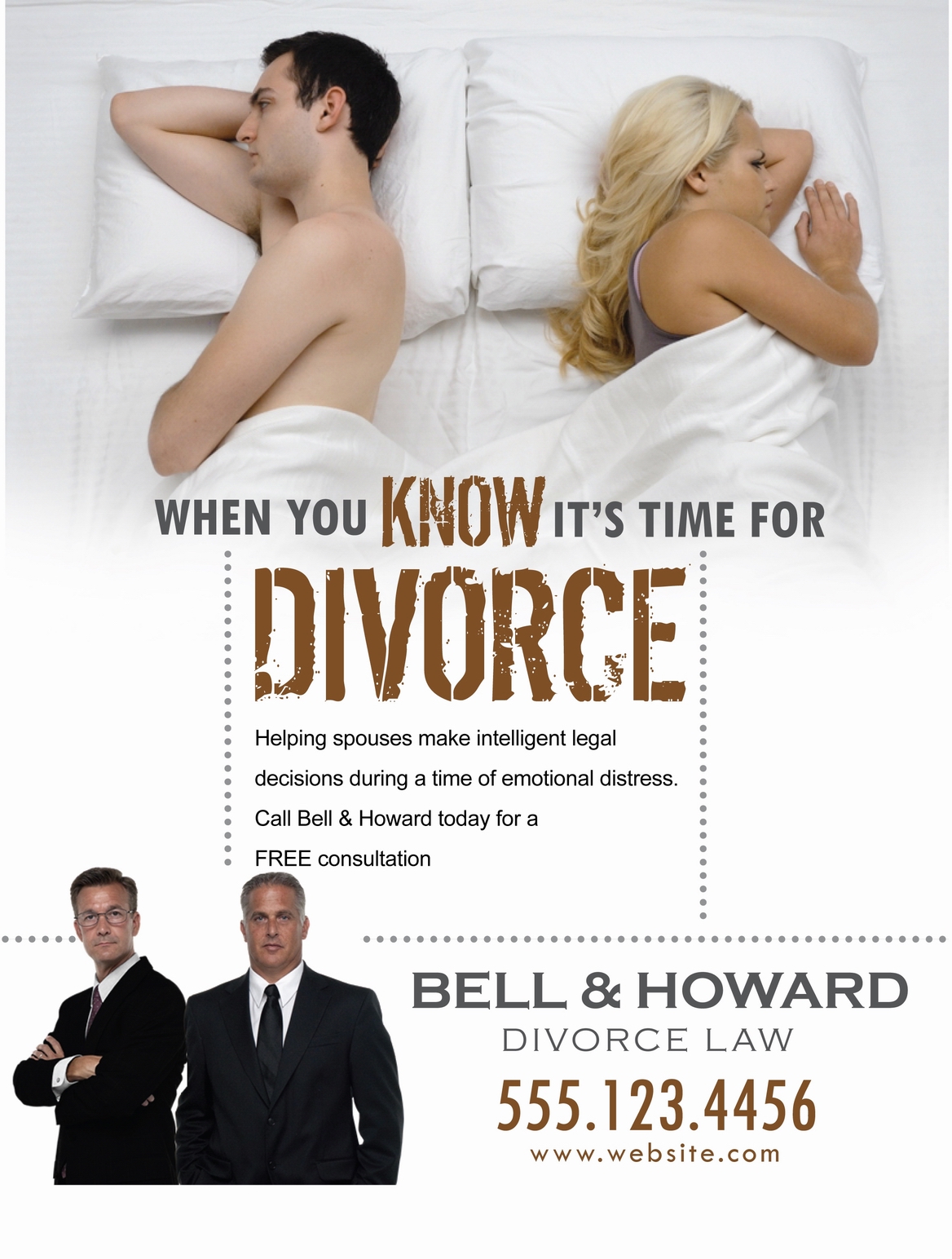
Types of articles are advertised in law magazines?

- Local University offering summer classes,
- Text book rental service
- Law firms that allow internships
- Quicken
-Microsoft
-Men's Warehouse
What advertisements include:
-Professional attire
-Academically Driven
- Bold Colors
Ex:

Subscribe to:
Comments (Atom)